Wedge Co-ops
Problem
The Wedge Community Co-op needed a creative partner who could bring cohesion and clarity to a brand with many moving parts. As a longstanding community hub with multiple priorities—supporting local farmers, promoting sustainability, and serving a diverse membership—their messaging risked becoming fragmented across platforms and touchpoints. They required a Creative Director who could refine their visual identity, streamline communications, and ensure the brand’s values came through consistently, whether in-store, online, or in broader community campaigns.
How I Solved It
As a contracted Creative Director, I developed a brand framework that aligned The Wedge’s mission with clear, consistent storytelling. I refreshed their visual identity to feel modern yet rooted in community, and introduced design systems that could flex across print, digital, and in-store environments. By creating cohesive campaigns, refining signage, and elevating member communications, I ensured every touchpoint reinforced the co-op’s values of sustainability, local support, and accessibility. This unified approach not only strengthened brand recognition but also deepened trust and engagement among members and shoppers.
Project Overview:
My Role: Creative Director, Graphic Designer
Date: 2023-Current
Scope: Rebrand, Ongoing Graphic Design + Creative Direction
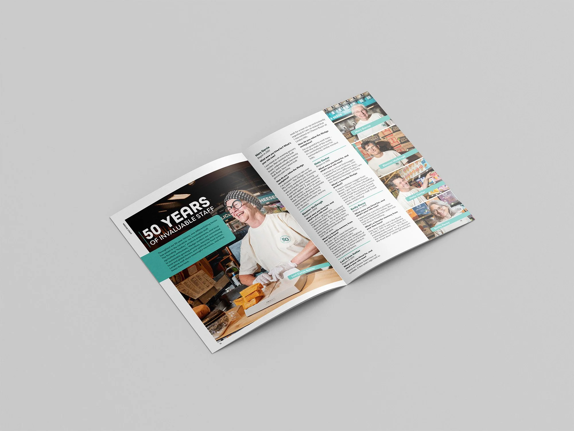
Deliverables: Brand Guide, Merch, Signage, Advertising, Newsletter & More
Tools Used: Illustrator, InDesign, Photoshop
Collaborators: Lauren Cutshall (Photographer)
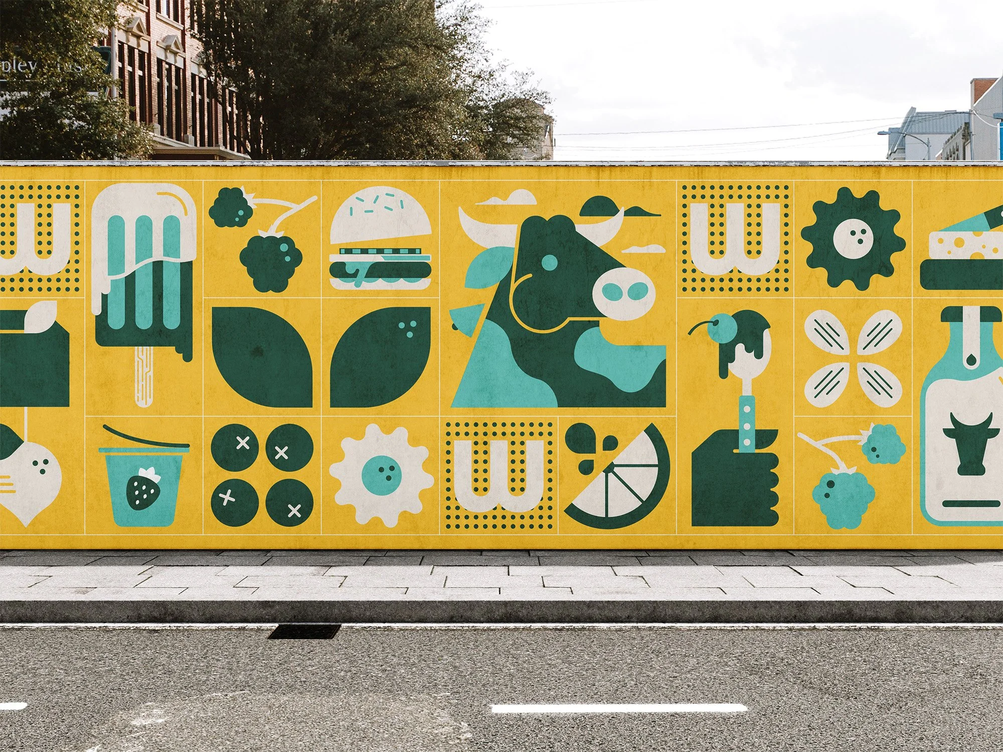
Step and repeat designed for refrigerated bunkers and wall clings.
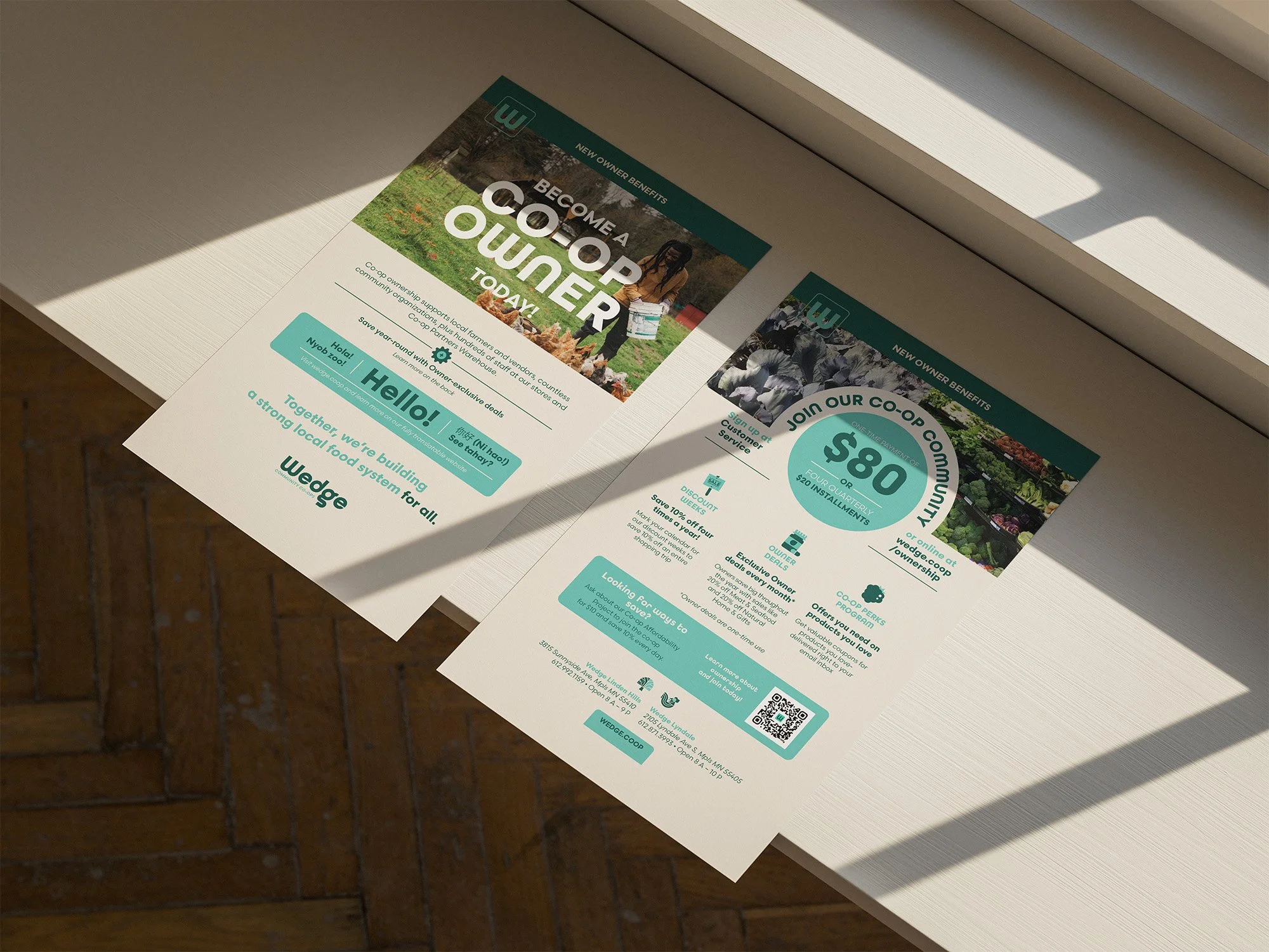
Owner material handouts.
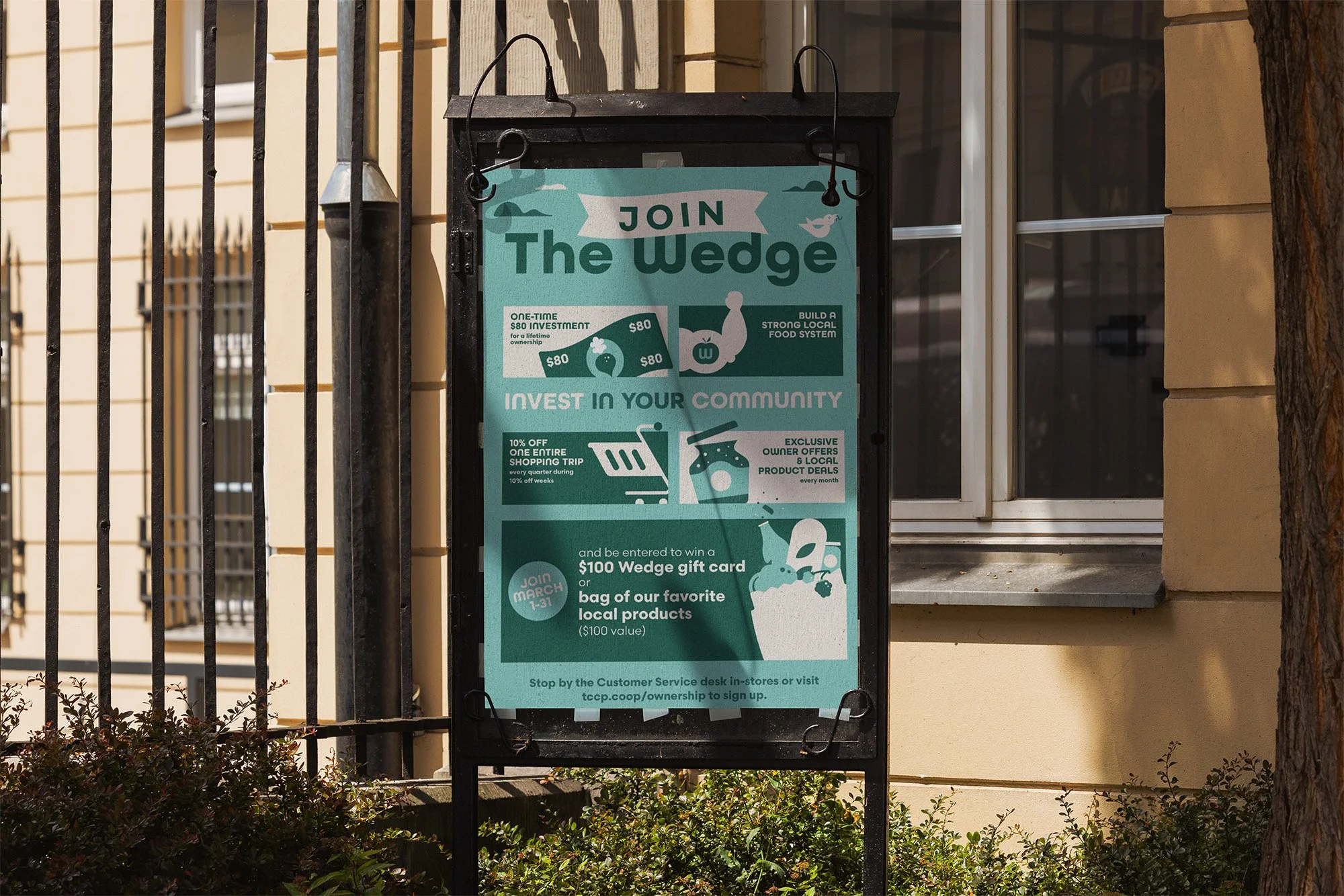
Owner drive campaign awareness poster.
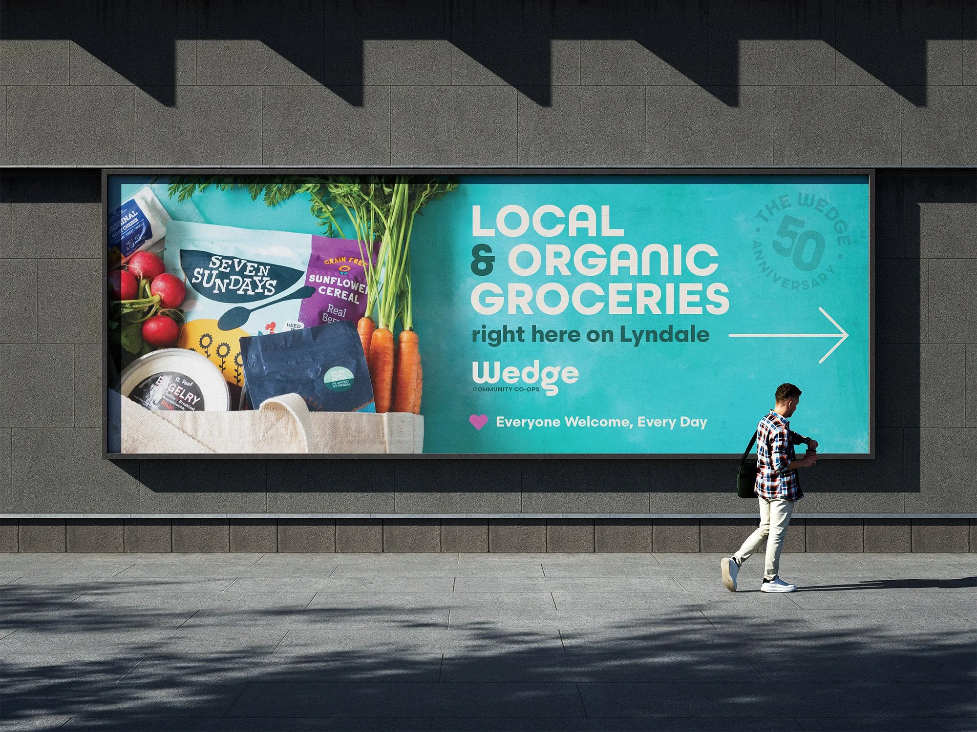
Billboard that was displayed at Lyndale & Franklin.
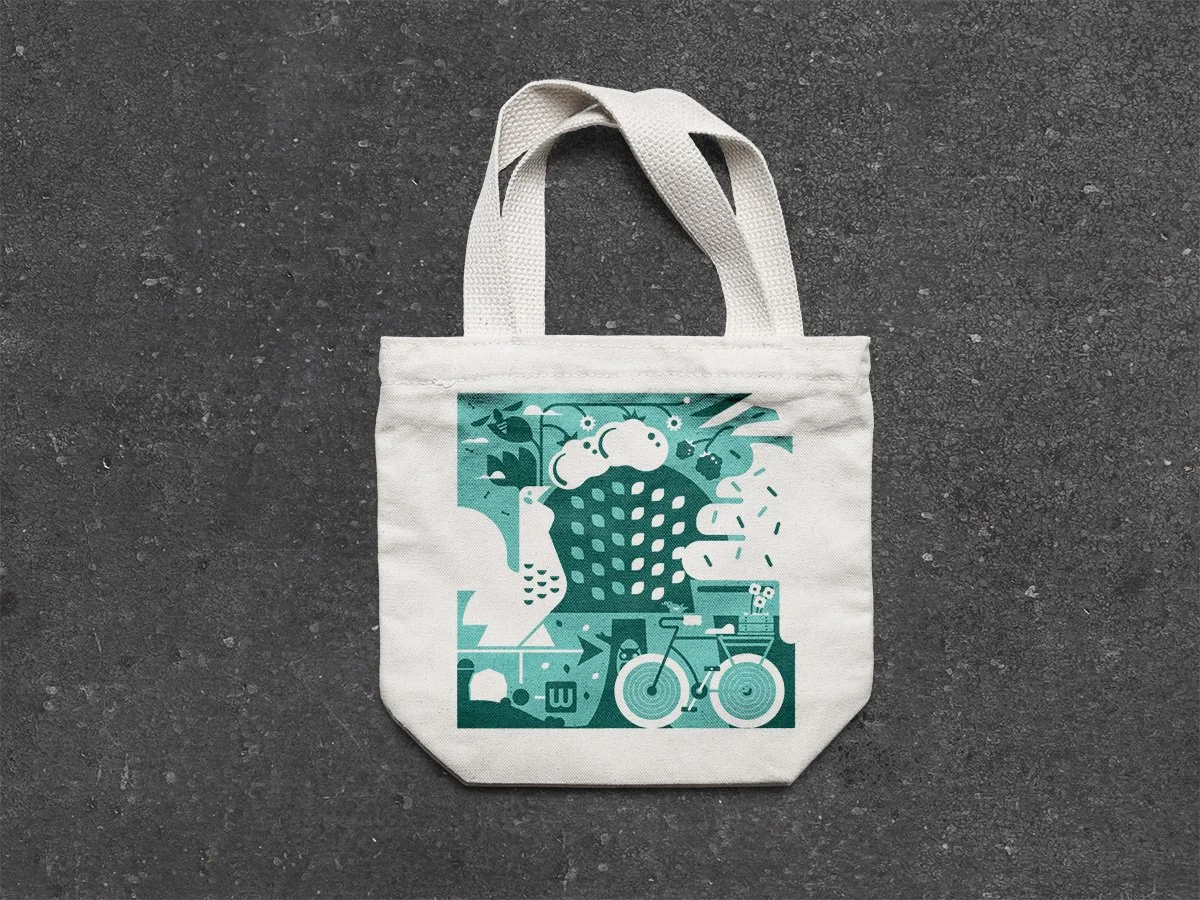
Wearables, totes and more for The Wedge Co-op.
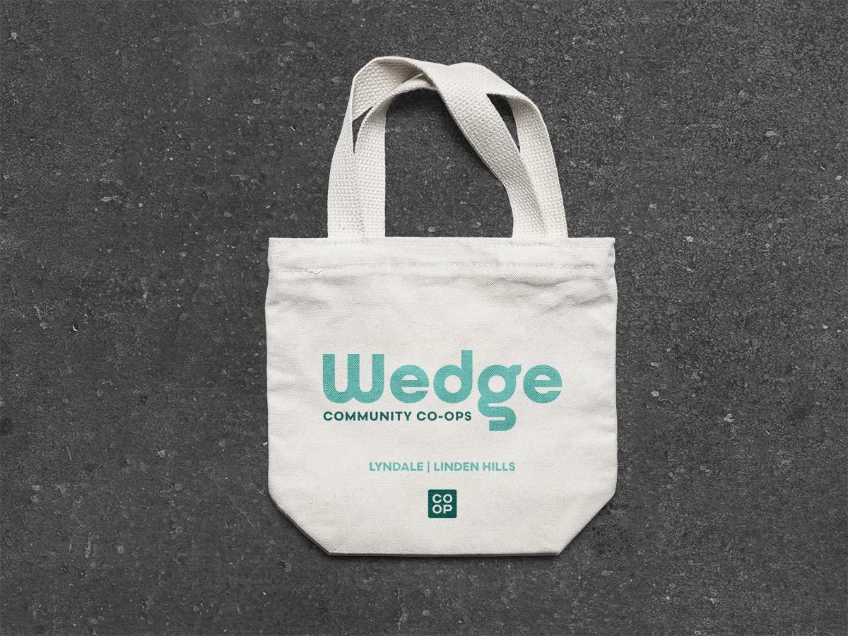

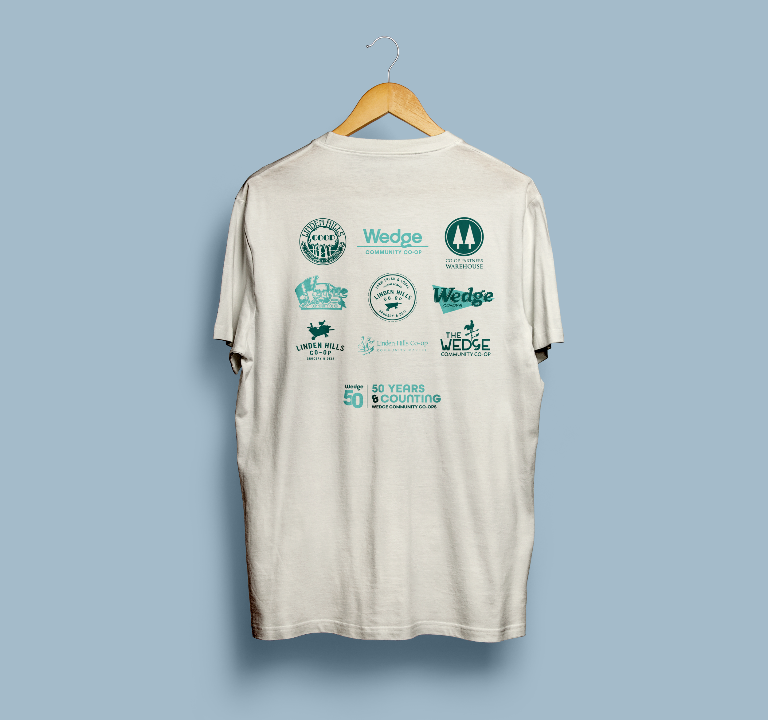
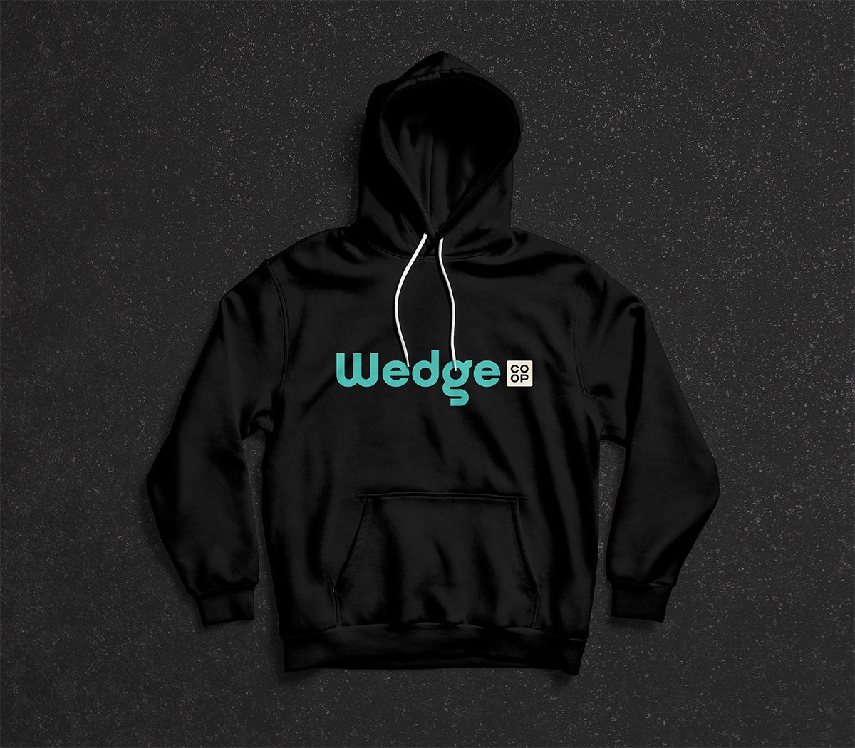
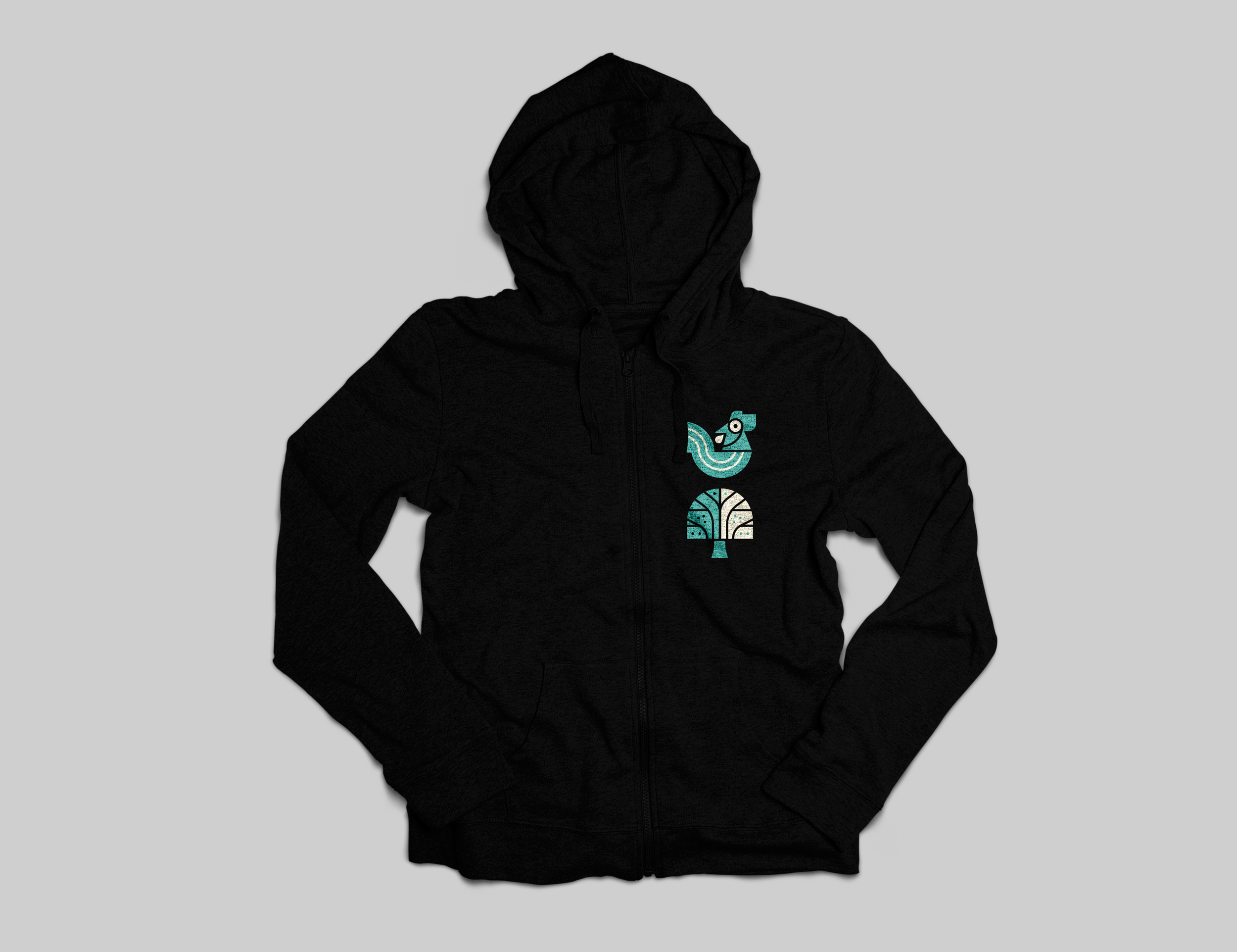
A refreshed brand for a co-op with 50 years strong.
The co-op’s customer base centers around Conscientious Cooks—people who gather around good food, explore new cultures through flavor, and spend in alignment with their values.
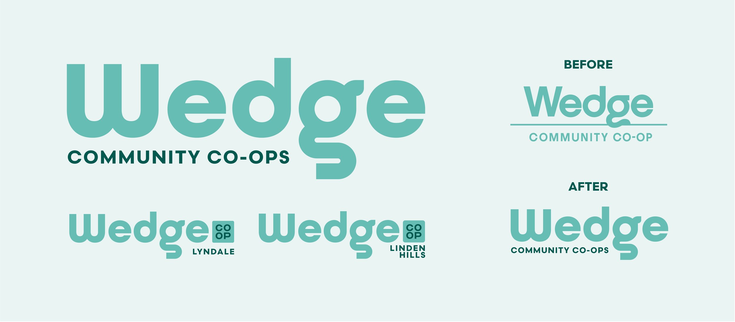
With this in mind, I updated the co-op’s logo to better reflect their thoughtful, community-minded audience. The refreshed mark features a bolder typeface with subtle retro cues for a modern yet nostalgic feel. The distinctive “g” includes a small leaf ornament on the ascender—a nod to freshness and natural foods. To honor brand continuity, I placed the “co-op” indicator within a boxed element, referencing the original logo while allowing room for a clean store location lockup below.
